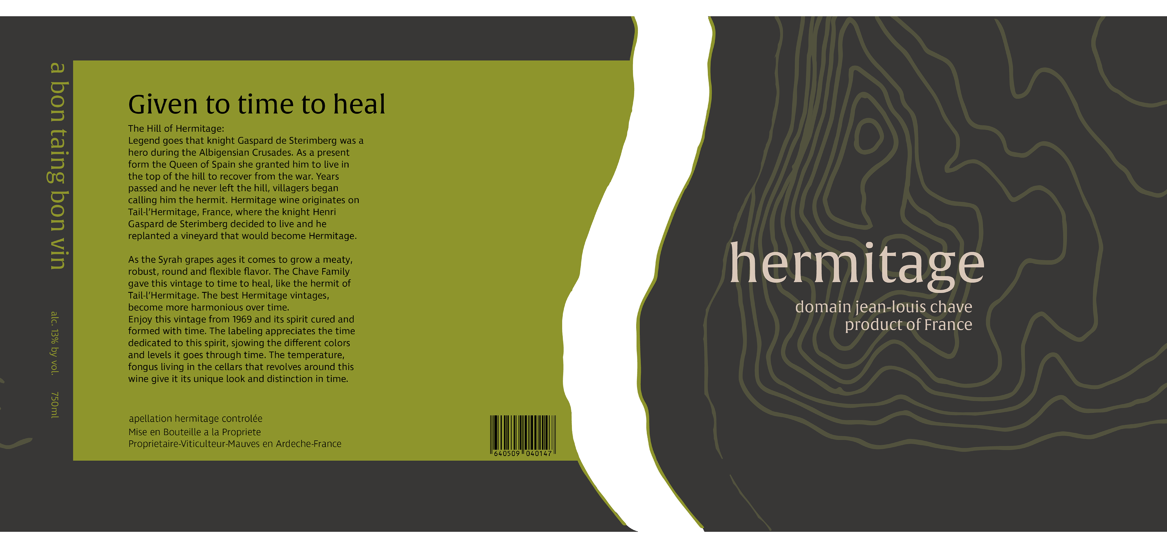
Hermitage Logo and Packaging Revamp | 2018
Inspired in the documentary SOMM: Into the Bottle, this project focuses on revamping the logo one of the most exquisite wines in the world: 'Hermitage'. Striving to focus on its legend and origin, the label and choice of color palette represent the topography of the land the wine was harvested in. Keeping a classical touch with the typeface representing age, experience, and quality.
